Demons' Score
(IOS, Android, Tegra)
Developer : INIS
Publisher : Square Enix Japan
Project Roles : Ingame UI design, Logo design, Menu and UI Element design
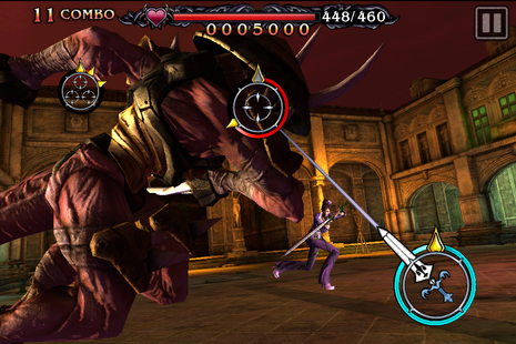
Ingame UI
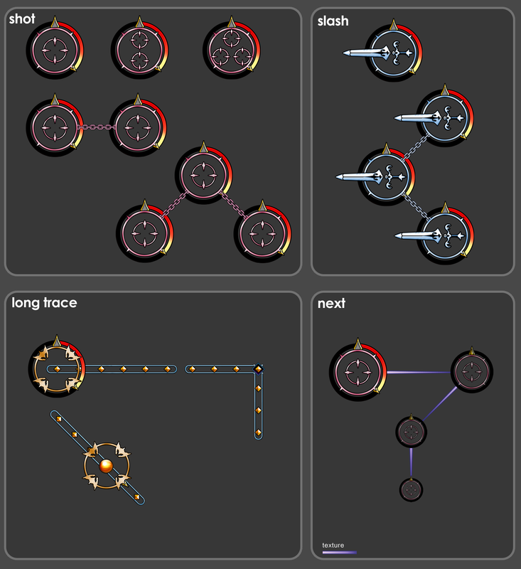
Due to the IOS Unreal Engine system architecture, a normal 2D UI was too heavy on the GPU, so a 3D HUD object UI using skeletal meshes was required. This meant that all in game UI excepting the score panel was authored in 3DS Max as low poly animated objects.
Due to the IOS Unreal Engine system architecture, a normal 2D UI was too heavy on the GPU, so a 3D HUD object UI using skeletal meshes was required. This meant that all in game UI excepting the score panel was authored in 3DS Max as low poly animated objects.
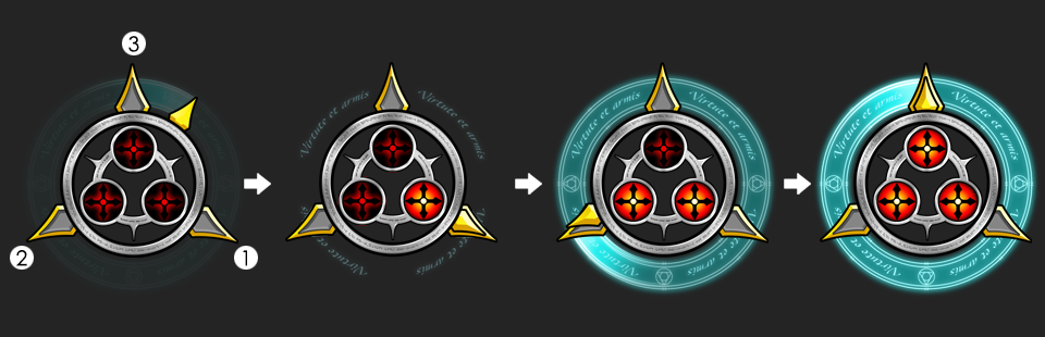
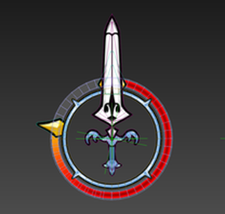
The ingame UI was based upon taps and swipes, sword directions indicated a swipe in the direction the sword pointed, and targets indicated a tap, each attack is executed in typical rhythm game fashion by tapping each element with one or two fingers when the timer ring on each element reaches zero, and rated on precision.
To increase sequential clarity, each rhythmic "chain" was connected with a thin linking arrow. Simultaneous swipes and taps were linked with a chain motif
As the icons were overlaid over realtime game movies, the timer and slash design was gradually simplified to increase contrast and allow maximum visibility of the game under the UI, in order to work over numerous brightnesses and contrasts of environment over the entire game.
Initial tap icon concepts
As mentioned previously, while these designs had more detail and looked better in isolation, they were simplified under the Art Directors' request to create more open space, contrast and to see the game action below the UI.
this concept demonstrates the "triple shot" that required 3 fingers.
As mentioned previously, while these designs had more detail and looked better in isolation, they were simplified under the Art Directors' request to create more open space, contrast and to see the game action below the UI.
this concept demonstrates the "triple shot" that required 3 fingers.
Simplification of final icons
As mentioned previously, while the initial designs had more detail and looked better in isolation, they were simplified under the Art Directors' request to create more open space, contrast and to see the game action below the UI.
Post-Mortem thoughts of final UI contents.
Overall I was I somewhat dissatisfied with the final art direction choices for this game, and I think the final versions' appearance should have been somewhat more detailed, anarchic and "grungy", but unfortuately the final direction was not my choice.
As we could not use Scaleform / Flash for this project, plus severe GPU and overdraw limitations for ingame UI, 2D and menu authoring was done entirely by hand using numeric data entry, leading to fixed width fonts, empty looking result screens and somewhat uninteresting action prompts, of which I would have like to have made more dynamic and more in tune with the logo artwork.
3D Skeletal mesh
|
In game overlays
|
Simplified concepts.
Logo design and lobby poster
The game story, written by Yoko Taro of "Nier" fame, revolved around a computer program that emulated a musical score that summoned demons from hell, therefore a demonic type treatment , a traditional Square Enix "behind the logo" musical motif and a hot metal hellish finish felt like an obvious choice.
A square Enix game logo has a slightly traditional feel so I referenced a number of the companies' recent game logos to establish an idea and the layout balance.
While the background stave motif remained, numerous iterations of the logo were required, usually Square Enix's design department created the final logo design, but they were happy with my final treatment and merely made final contrast adjustments to the image.
The lobby poster was design by capturing the 3d models direct from UE3 at high resolution, cleaning up rough poly eddges and creating a composition and visual treatments in Photoshop